
A call for good figures in research papers
Over the last few years, I became more and more into creating good figures to use in research papers. It probably started when I was reading a book about data science in the mid of my phd. Back then I start to learn about matplotlib for Python and ggplot for R. I was somehow impressed by the quality of these figures and the reasonably low effort required to create them. I also remember that I convinced myself to update all figures of a 30+ pages paper that we have been working on for, at least, 3 years. Needless to say that I was very proud about the new figures on the paper (and its eventual acceptance).
But it was not always like that. In the first paper published during my phd, I used OpenOffice to create the figures. By the time, the quality of the figure didn’t bother much me; In fact, I was still learning what is research and how to do it. The quality of the figures was not more important than trying to finish a 6-page paper and submit for that first edition workshop that we never heard of. As a result, this figure came along with our workshop paper.
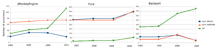
(If you agree that the above figure is far from being good, keep reading.)
Figures should not only convey an information, but they should also do it easily and quickly (“a picture is worth a thousand words”, they said). However, it only works if you have good figures. For instance, would you be surprised if I tell you that the values of the red line of the third figure is greater than the red line in the first figure? Why would that be the case? This happens because these three figures are under different scales; this makes such a comparison misleading. Still, the x axis use different time windows for each figure, which is also misleading (I’m not sure if that was a typo or if the x axis indeed employs different time window). A simple fix (put the figures in the same scale and using the same time window) would make this figure much more comprehensible. This is why I wholeheartedly agree with Philip Guo when he says:
paper-writing is like 95% making good figures, and then 5% describing those figures in a sensible way
— Philip Guo (@pgbovine) August 15, 2016
Fast-forwarding to 2018, and after many other figures created throughout the course, I started to observe bad patterns that prevent researchers from plotting good figures (although I’m not assuming the figure I create are the best ones; but I’m always trying to improve this). Even though the presence of these bad patterns in a paper does not mean that one would argue for rejection, it will hardly convince anyone to accept it. Here we go:
-
Similar figures under different scale: This is the problem address in the figure above. The solution is simple: employ the same y axis for all figures. (example: fig 1 of this paper).
-
Save figures as PNG or JPG: Or any other compressed figure format. These formats degrade the image quality, which is particularly relevant when our peers still have the culture of printing papers in b&w for review. Moreover, when reading on screen, if one wants to zoom in an image for a better understanding, compressed figures degrade even more. The solution: save figures using a vectorial format (e.g., eps or pdf).
-
50 shades of the same color: This is also to ease the review for those used to print in b&w. This happens when one uses different shades of the same colors, a common practice in heat maps (example: fig 11 of this paper). As a fix, instead of having 50 shades of blue, many heat maps can be done with 3-5 shades.
-
Skewed by outliers: This is a common pattern. The data has outliers and the figure is skewed when they are present. Sometimes we are forced to remove them, otherwise they could limit the understanding of the figure. However, removing outliers only because they do not appear handsome in the graph is not a strong argument (although I did that myself too). A better approach is to use the logarithmic scale.
-
Labels with small font: This makes it harder to understand the meaning of the figure (example: fig 5 of this paper). Add to this a low quality JPG figure. No one would understand what the figure is supposed to say. The fix? Increase the font. If necessary, increase the figure size.